Company-wide ServiceNow platform
Making employee support easier to navigate
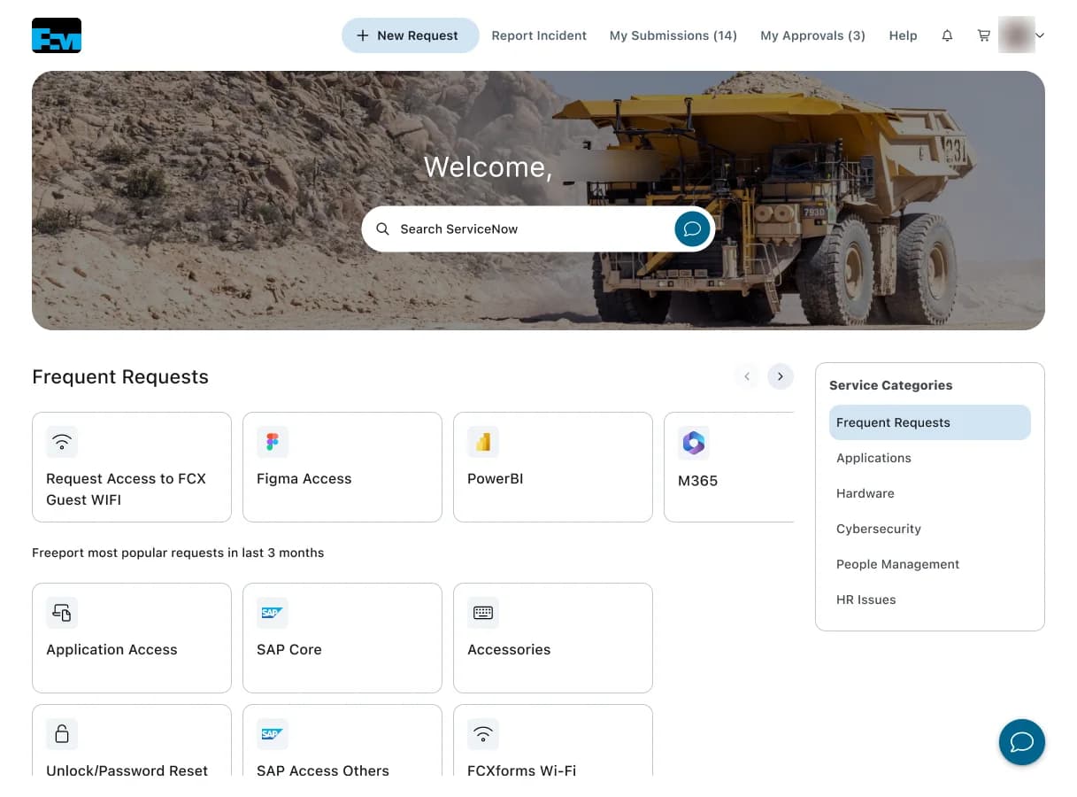
I researched and redesigned how employees find help, submit requests, and track progress in ServiceNow. The company-wide redesign served a workforce of approximately 28,000 and paired new navigation with a visual system built for the platform's constraints.
Result
Shipped revised navigation, request flows, and a shared visual system with the ServiceNow development team.
- Year
- 2025
- My scope
- Led deep user interviews with primary stakeholders and power users, re-architected the navigation flow, and designed the platform's modernized employee experience.
- Collaborators
- Primary stakeholders, key power users, platform developers, and IT service owners. The developers implemented the shipped experience.
Finding the right form was the first problem
ServiceNow gave employees a place to report issues, request services, and track work. Research surfaced confusing catalog labels, redundant request categories, and uncertainty about whether an issue belonged in an incident or a request flow.
Those navigation problems had operational consequences: people struggled to find the correct form, tickets were misrouted, and broad Other Requests categories absorbed work that belonged elsewhere. The redesign needed to clarify the route into support as well as the interface around it.
The employee's first decision should be what they need help with, without having to learn how the platform organizes it.
A visual system the platform could support
The visual redesign introduced a clearer type hierarchy, restrained color system, consistent spacing, and reusable card and navigation patterns. Search, frequent destinations, submissions, and approvals each received a clear place in the page hierarchy.
Because the experience still had to live inside ServiceNow, I translated the system into global design tokens and platform-compatible SCSS guidance. That made the visual modernization repeatable across the platform instead of limiting it to the screens shown in Figma.
Shipping inside ServiceNow
Platform developers implemented the shipped experience. I worked with them on navigation structure, interface patterns, and CSS primitives so the research-backed architecture and modern visual language survived the platform's constraints.
The redesign established a company-wide foundation for ServiceNow. Adoption and task-efficiency changes were not measured after launch, so the outcome I can claim is the shipped platform modernization, not an unsupported performance metric.
◆Decisions
The decision
Interview primary stakeholders and key power users before defining the new navigation.
The tradeoff
It delayed visible interface work and surfaced needs that could not all fit into one navigation model without prioritization.
The consequence
The architecture was grounded in how the platform's most important audiences actually worked, giving stakeholders a shared basis for changing long-established flows.
The decision
Re-architect the navigation instead of preserving the legacy flow under a new visual layer.
The tradeoff
Changing familiar routes creates more implementation and change-management work than a reskin, especially for power users who have learned the old structure.
The consequence
The shipped experience gave employees a coherent hierarchy for finding help, starting work, and returning to tasks already in progress.
The decision
Express the modernization as reusable tokens and platform-compatible patterns, not isolated page comps.
The tradeoff
The system work is less immediately visible than a sequence of polished screens and still depends on implementation discipline inside ServiceNow.
The consequence
The modern visual language could extend beyond the initial screens and remain consistent as platform developers applied it across the employee experience.
User researchInformation architectureNavigationVisual designEnterprise platform
◇Artifacts
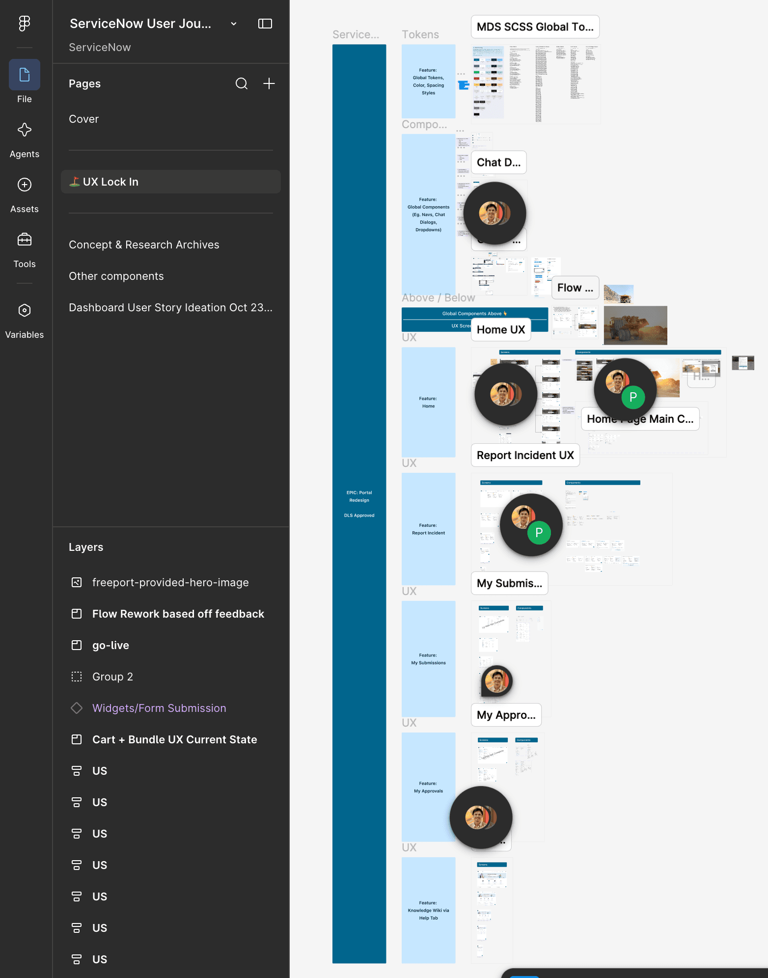
The company-wide redesign file: re-architected navigation and feature flows supported by a global token sheet authored for ServiceNow-compatible SCSS.Open full-size image 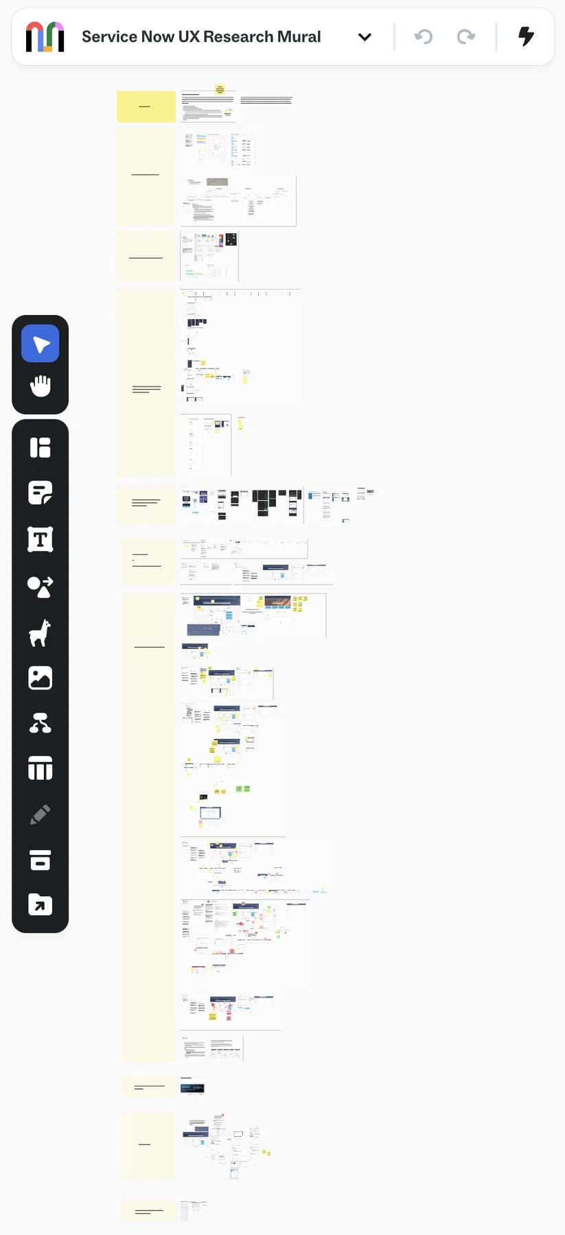
The ServiceNow research workspace, capturing in-depth interviews across primary stakeholders and key power users. Text renders as placeholder bars at this zoom for privacy.Open full-size image